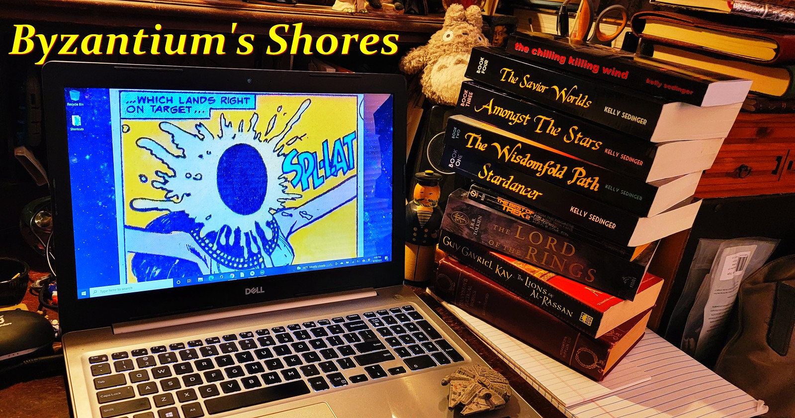
OK, here's a question: is it really that hard to read pages that have light text on dark backgrounds, or is this just something that people believe because someone "in the know" once told them that this is the case? I've never considered light-text on a dark background hard to read, in-and-of itself -- in fact, I remember playing text-adventure games for hours on an Apple II and other ancient dinosaur-computers where there was no choice other than light text on dark background, and I didn't go blind. (I wear glasses for mild farsightedness, but that's about it.) But then, the vast majority of weblogs I read are dark-text-on-white or some other light color, so I can't say that if I had to sit for hours in front of light-text-on-dark, I wouldn't find it hard. I guess I like a contrast more than anything. So is this site, for example, hard to read?
(I'm wondering because in the midst of complaining about some stuff, Rachel Lucas specifically states that she refuses to read light-text-on-dark, which means she'll never link me, I guess. But then, she'll also never link me because I am a "liberal wanker", so it probably doesn't matter anyway.)

No comments:
Post a Comment