I can't be mean about a quarter that features a grazing buffalo. It's a simple design that works well. (And to be honest, if any state was going to include their motto, I'd have picked Kansas, since I like their motto - As astra per aspera, "To the stars through hardship" – a great deal.
Kansas's quarter: $0.19

Is the South Dakota quarter the only coin in US history to feature the heads of more than one President? It might be, with Washington on the face, and Mount Rushmore on the reverse. I just wish they'd gone with Mt. Rushmore by itself, and not felt the need to include a bird and the plants rising up the side. Those feel like committee additions.
South Dakota's quarter: $0.21

I look at this and almost wonder if North Dakota decided to teach Kansas a lesson: "You put a bison on your quarter? Well, we're gonna put two on ours! Heh!" Still, this is another favorite of mine. I like the sun rising in the background and the rocky form of one of the Badlands there. (However, they could have been perverse and put Marge Gunderson puking in the snow-filled ditch on their quarter...but then, most of the movie's action takes place in Minnesota, so that probably wouldn't work.)
North Dakota's quarter: $0.22

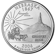
Maybe it's all those grade school units on the Oregon Trail I had to sit through when we were living in Portland in my youth, but the design of this quarter really makes me think back to those stories of hardship my teachers used to tell us in those studies. This is a wonderful design; I love the stagecoach making its way past Chimney Rock, and the bright, full sun hanging above it all. It's just a bummer for Nebraska that it's chiefly known for being a place people have to pass through to get to other places.
Nebraska's quarter: $0.23

Well...er...well...aww geez, I hate saying this, but...I hate this quarter. With a passion. I can't believe this is what Wyoming came up with. I look at this quarter and I think, "Really?" We're talking about a state that has Yellowstone National Park in it, and Devil's Tower, and the Grand Tetons; instead, they came up with a silhouette of a cowboy ridin' a buckin' bronco. And not even a picture of the cowboy, just a featureless outline. And what does the cowboy have to do with the inscription ("The Equality State")? I can't imagine the creative process that led to this, the most boring quarter in the entire program. Ugh. This is like the work turned in by the kid in the class who would do the exact minimum amount of required work to avoid receiving a Zero on his assignment.
Wyoming's quarter: $0.02

The inscription "Big Sky Country", and some of Montana's many mountains, rendered small at the bottom of the quarter, in order to leave room for the looming skull of a dead bull! This quarter always makes me laugh a little, which I'm sure isn't the intended effect. I just find the whole Western motif of dead cow skulls to be a bit funny. I'm not sure that if I was tasked with choosing a design for a quarter honoring one of our country's largest and most beautiful states, I'd go with the bleached bones of a picked-over carcass.
Montana's quarter: $0.13
Next time we'll finish up the fifty states. Huzzah!

8 comments:
While I don't disagree that Wyoming's design is less than exciting, it is consistent with the rest of the state's official iconography. This same cowboy silhouette appears on Wyoming license plates and (I believe) on the billboard at the state line. For whatever that's worth.
And what's with the Montana design? What are we saying here, that the big sky is home to a gigantic flying skull? Sounds like someone has seen Zardoz a few too many times...
The other problem with the Wyoming coin is that it wears down quite easily.
I love this. "Committee addition." Heh.
I'm trying to think of what my family's quarter might look like... a chef's knife for my husband, a baseball for my kid and a bottle of cheap wine for me? Maybe I'll keep working on it.
I went to Calaveras High School, in Calaveras County. My Yearbook was called the Skull.
I'm always thrown off by the Nebraska quarter. While I'm sure that they're proud of Chimney Rock and all that, when I think of Nebraska the last thing I think of is "towering landscapes" (well, "coastal serenity" is probably the last thing I think of, but "towering landscapes" is 2nd last). Because of that I always mistake this for Wyoming or Utah at first glance.
Jason: Now I think even less of Wyoming's quarter, if that were even possible. Instead of doing something nice and creative and new, they just repeated their friggin' license plate design? Really? Geez.
Well at least you didn't have to sing "Ad astra per aspera" umpteen million times freshman year. The Hanley Jackson was one of the strangest pieces we did at College. The tape of sound effects was bizzarre to say the least. Craig knew what he was doing when he volunteered to run the sound system that year, so he wouldn't have to sing it.
Chris
Yep, Wyoming just copied their license plates:
http://www.worldlicenceplates.com/usa/US_WYXX.html
Actually, though, even the license plates have some background elements that make them a bit more interesting: Devil's Tower, a rail fence, mountains... Somebody really blew it with the quarter design.
Post a Comment